I curiously clicked a link in a Designer News email recently that led me to what I thought was a perfect example of a product sales page:
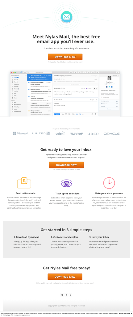
It’s a tried and tested structure, but I don’t remember seeing one as succinct and effective as this for some time. And by effective, I mean that even in my scepticism of new and alternate Mail apps (hence the curiosity of the click) I found myself considering a download, despite noting nothing that Nylas does (for my actual email needs) that my existing mail app doesn’t do already. The page is just so good!
Looking closer, I noticed the URL string – try.nylas.com/nylasmail/?utm_source=DesignerNews&utm_medium=email – and realised the page was pretty specifically targeted. Continuing curiously, I wondered what was on the bare try.nylas.com address:
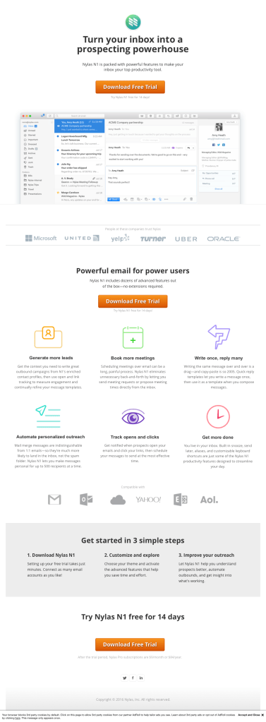
Pleasantly surprised by the small but clearly considered differences, I was amazed at how effective even the title and strapline changes were, the first, targeted to me as a DN reader, saying:
Meet Nylas Mail, the best free email app you’ll ever use.
Transform your inbox into a delightful experience!
And the second, not for me, saying:
Turn your inbox into a prospecting powerhouse
Nylas N1 is packed with powerful features to make your inbox your top productivity tool.
While the first (nearly) worked on me, the second really would have not. In fact the second is so misdirected for me that seeing it actually turned me off a little. ‘Prospecting, powerhouse, productivity’ being words I relate to less as an interaction designer. ‘Best, delightful, experience’ however… where do I sign!
Even the button difference of ‘Download Now’ vs ‘Download Free Trial’ I can consciously acknowledge as having different effect on me (being oddly cautious of any button with the word ‘Free’ on it).
Intrigued and impressed at their expert targeting of my cognitive biases, I went one URL level further to see what they had on nylas.com:
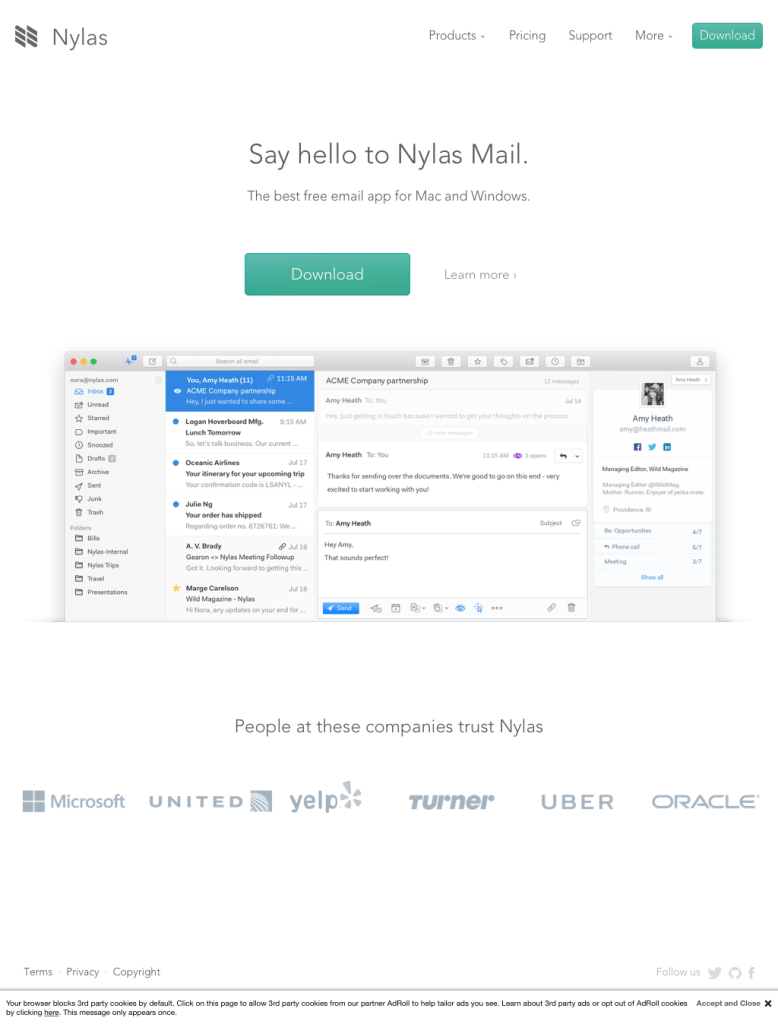
Far less impressive or instantly effective. But then, as their main destination, this homepage has to appeal to all. Free, experiential, individual users, and productivity maximising enterprise folk alike.
Whatever I think about their app or the Mail app sector, this team is clearly on it, and taking optimisation and marketing tweakery very seriously. Taking a wayback look at their previous Inboxapp incarnations, adds to this fact. They’ve changed and adapted a lot. One to watch, even if just for a marketing masterclass.
