Public notice design patterns

After finding The Causal Optimist blog and seeing a post on book covers, this one reminded me of my own neighbourhood form/sign, and that I was going to dig out some favourites in what is essentially a design pattern of public notices being played for laughs.

A pink book cover with 'free therapy' written in capital letters above a little smiley face. Underneath that are perforated four tear-off-able tabs that say 'Stories by Rebecca Ivory'. Two tabs appear to have been ripped off revealing book reviews that say 'Arresting and innovative' Sally Rooney, and 'I ate it up in two sittings' Samba Sams
Free Therapy by Rebecca Ivory; design by Luke Bird (Vintage / March 2024)

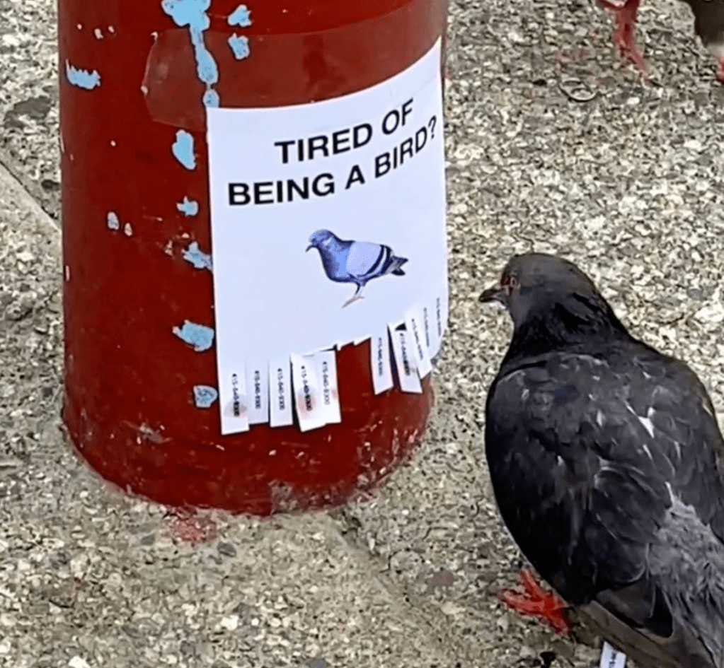
A recent well done version of the tear-off-tab gag is from the wonderfully absurd Pablo Rochat (video on Instagram):

A still image from a video showing a pigeon apparently reading a small sign that says 'tired of being a bird?' above a picture of a tiny pigeon. At the bottom of the sign there are tear-off-able tabs that appear to have a phone number on them. To tabs have already been torn off. The pigeon has a distinct look about it that says it will also take one.
Tired of being a bird? By Pablo Rochat, 2021.

The first version of the tear-off-tab that I remember being used for fun was a very simple sign that offered little tabs of ‘hope’ to be torn off. Annoyingly though I can’t find it. It must have been from the early 2000s, but finding it again in this haystack of copycats/remixes is sadly impossible.

Excitedly though, I was able to track down this utter classic:

A photo of a telegraph post with a typically British residential suburb in the background. An A4 sign, with a picture of an unusual looking fluffy tabby bearded cat, is taped to the telegraph post. The words have you seen this cat? Because it is awesome. Are written in capital letters.
Have you seen this cat? Because it is awesome, from Lizzy Stewart’s Flickr, 2008 (I had totally forgotten that this was source, and had to do a load of reverse image searching to find it. Glad it got there in the end).

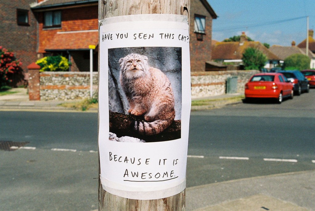
No tear-off, but in my opinion, still the best ever play on the DIY public notice format. Format, pattern, system, trope? Oh, how these words overlap in annoying ways.