When frustrating user experiences become the subject of observational comedy. A thread*
(But also a post with some points, if you skip toward the end).
1. Sign up friction – Brilliantly identifying one of the sad reasons more people haven’t left Twitter yet – Stevie Martin, trying to leave Twitter:
2. CAPTCHA and authentication hell loops – Stevie Martin, Verifying that you’re not a robot:
3. Online checkout experiences that suck – Going even further back with comedy UX observations – Google Analytics, In Real Life, Online Checkout (featuring Nick Mohammed in a very Nate-like role… perhaps this ad takes place in the Ted Lasso cinematic universe?):
4. The myriad of awkward (now accepted) patterns and behaviours that video calls have encouraged – Design Thinking Comic, Anatomy of a Zoom call:

5. Infuriating password creation experiences, part 1 – A thread within the thread – Design Thinking Comic, P@55w0rd5.

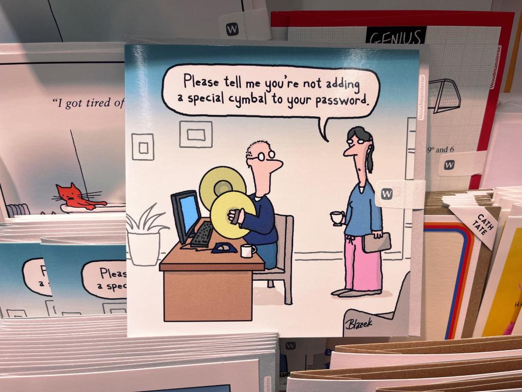
6. Infuriating password creation experiences, part 2 – Waitrose ‘adding a special cymbal to your password’ gift card.
7. Infuriating password creation experiences, part 3 – Waitrose ‘Password Hell’ endless user journey loop gift card.

The phrases ‘funny because it’s true‘ and ‘many a true word said in jest‘ keep coming to mind in my posts at the moment. Finding Stevie Martin’s Mastodon sketch above nudged them again, and the memory that I’d collected a few other examples of bad UX inspiring laughs over the years.
These and many other experiences are recited at me (with distinctly implied accusation) when I tell people I work in user experience design, or that I help to make websites, apps and services easier to use. And it’s really embarrassing.
In particular though, it’s cookies and pop-up experiences that most people seem to blame me for! I’ve given more mini-explainers and workaround tips on these intertwined issues than anything else. And the best jesting I’ve seen about it so far is the brilliant how-i-experience-the-web-today.com
These poor experiences are maddening to users, but the fact there are still so many is what maddens and saddens me most. The persistence of poor user experiences – most of which we’ve known how to remedy for decades – feels inexcusable. So how do we excuse it? How did user experience become a punchline? And how might we better address the causes of these seemingly basic issues?
I’m exploring these questions at the moment, through historical, educational, cultural, and consultative lenses. The repetition feels too big to ignore. Get in touch if you’re feeling similarly exacerbated or if you have your own theories about causes and solutions.
Or, drop me a line to share your own UX lols. At the very least, being able to laugh at ourselves could be therapeutic!
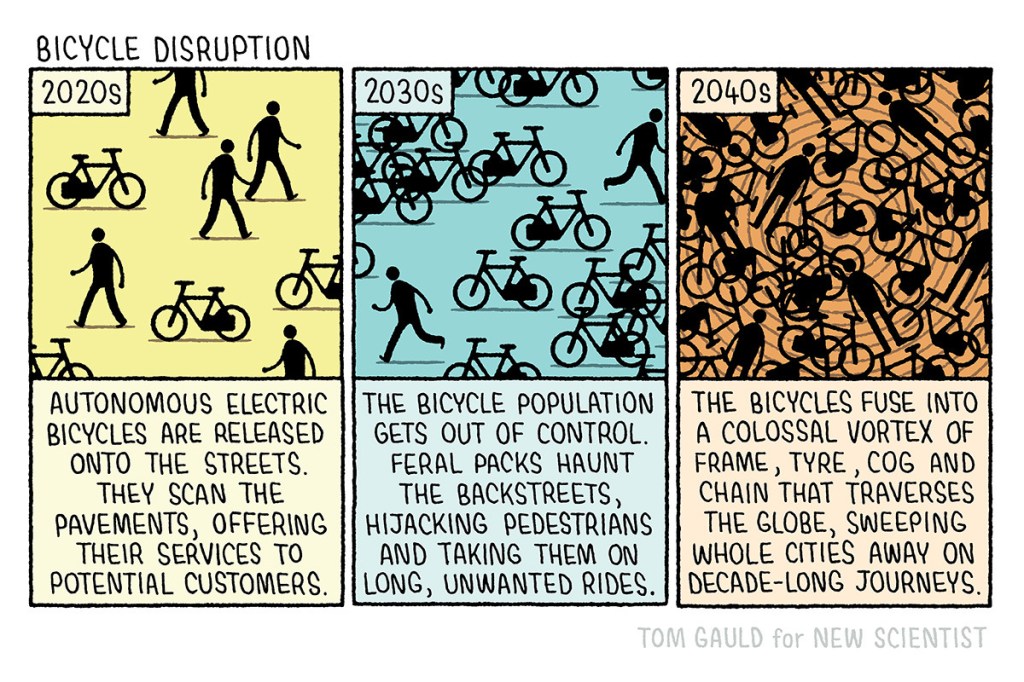
8. Bonus frustrating UX comic for getting this far. Hire bikes littering streets everywhere – Tom Gauld, Bicycle Disruption:
Footnotes.
*Thread click bait! Another UX pattern that I bet annoys people no end, and that I’ve already seen many examples of people parodying. I wonder if this type of annoying UX tips more into the realm of deceptive.design though, which is a whole other topic that we need to address (so hats off to Harry Brignull for fighting that fight).
Taps! The theme of user experience being a joke, and a baffling example of UX actually regressing, can be seen in the world of tap/faucet design, as I nodded to last month. For more than a nod on the subject, Ben Terrett gave a recent presentation about taps. Join me in hoping that Ben expands on this soon.
There is no EU cookie banner law is a great recent piece that attempts to explain the issue that we actually need to address, and highlights that the cookie experience we currently love to hate isn’t even justified.
I had a quick search to see who else had used the clickbaity title ‘User experience is a joke’ but only found this 2016 LinkedIn post, which kind of relates, though it makes me think more of my post For the love of desire paths.
A particular reason that the persistence of bad user experience around password generation boggles me – and an example of how old the issue is – is that we made it the topic of our July 2011 With Associates “What is user experience?” website. Sadly the demo no longer works, but in essence the page was an example of poor UX vs good UX that recreated classic password form issues. This was not an original observation back then, just an obvious one to illustrate the point. I imagined we would have at least been better at it by now. How far we are from that however is, as I keep saying, frustrating and maddening.
