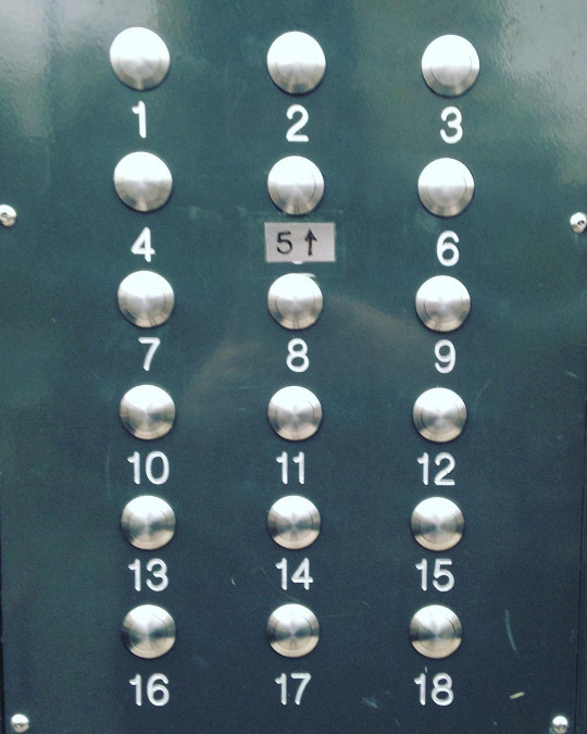
A great ‘bad design’ example and user story greeted me this morning in my Instagram feed (via Laura Kirsop):

These are the doorbells for our block of flats. We are flat 7 and roughly 75% of people ring the wrong flat. I have to admit it’s tricky due to #baddesign but remain shocked by the delivery drivers that swear they’ve been ringing us for ages / we never answered etc. and don’t believe us when we say they probably called flat 10. Just a little example of how crap design can make lives a little harder. (Laura Kirsop)
It reminded me of the ‘hanging chads’ debacle in the Florida election recount of 2000. How do these examples of user interfaces, that are built for the broadest types of audiences possible (anyone that might visit a building in London or anyone with a vote in Florida) get made? How many people, with power to cause effect, need not to care about think of other people?
Imagine everything that goes into building a building, then wiring the entire thing, pulling the right wires down to the front door, plugging them into buttons, physically etching the numbers of each flat into metal and then painting into the engravings so the numbers are clearer… all the while, not caring at all that a human might not actually know which button to push for flat 14.
Worse still, that the error states in this case are other humans that have to constantly tell the strangers buzzing their door that they have pushed the wrong button. Worser still, that if an ‘error state resident’ isn’t home, then the visitor receives no notice that they got the wrong button, while their actual hosts waits patiently in the adjacent flat.
Let’s take a moment to credit flat 5 and the guerrilla UX designer that must live there.
After pondering this this morning for a bit, we had our weekly With Associates stand up, at the end of which we digress with weekend anecdotes (until Erin stops us) and this morning Jamie shared a sad one about this elderly grandmothers telephone. It’s supposed to be super duper easy to use. Massive buttons. Clear type. Marketed directly to people that want things to be as clea as can be. Somehow she managed to switch the language to French (she’s not French) and had no idea how to switch it back.
This in turn reminded me of my bathroom extractor fan (stay with me) which this weekend I learned how to change the speed and timing of. Here’s the interface for that:

Those 6 tiny little switches in the middle. Special combinations of those change the time settings. Meanwhile, the black plastic nearest the white screw hole toward the top, hides 6 jumper switches, two combinations of which change the speed between fast or slow.
For a moment at the time I though this interface was awful. Another case, as per the two above, of awful user interface design where humans haven’t been thought about. Then it hit me that I wasn’t the target audience, and as Erin added this morning (yes, I managed to get this story out before he stopped us), these switches and jumpers make total sense to the electrician audience that users them daily. This then, arguably, is an example of great UI design!
In fact, might this be the better interface for changing language on an accessible phone? Hide the functions that are only used once, and probably by a specialist. Remove the ability from the real end user of making the mistake?
In writing this I’m remembering countless arguments from the 90s with PC users telling me I was stupid for finding Mac OS easier than Windows because windows has DOS and so means you can do anything you want. It’s Monday morning though and this digression should end… before Erin catches me.
Note. I’m conscious that this posts paints a picture of a grumpy Erin which isn’t fair. He’s lovely. Just efficient. Efficiently lovely :)
