This is a personal perspective, and I feel like a killjoy saying it, but I bet I’m not the only one. If anything, in our increasingly aware and openly neurodivergent world, I reckon we’ll start to hear more from folk like me. Those who feel hindered by icons, emoji, fancy buttons and emotive imagery. We’ve struggled along for too long. It’s time to stop this nonsense. ✋
Quick case in point. My flippant use of an emoji right after saying that sometimes I struggle with them. I’ll use it to illustrate what happens in my mind when emoji are peppered around the place.
Processing words vs processing images
When I’m in the middle of reading words, I’m processing what someone is trying to communicate. That’s not to say that words are infallible and always perfectly interpreted, in fact, far from it1. But they’re one of the best methods we have for expressing the mentalese of one mind into another.
The statement “It’s time to stop this nonsense” is clear. In fact, it’s almost impossible to interpret it in any other way. No further images are stirred in your mind beyond what I mean. You might not agree, but you understand, and you can move on. But when we get to that little ‘Stop’ ✋ hand however, things get messy (imo).
When my eye lands on the emoji, an uncontrollable string of semiotic meaning and imagery erupts. ‘Stop’ is in there, but equally loud are hold it, wait, no (as in, to the contrary of what came before), I have a question, calm down, wave, hello, high five, and Homer Simpson. Worst of all, it triggers culturally inappropriate meaning that was drilled into me as a child of the 80s, watching glorified cowboy antics in movies and cartoons, with Indigenous Americans reduced to fictional stereotypes.
It’s a lot to take in, process, and discard. And I can’t really ignore it because it’s not conscious. Like the “don’t think of an elephant” thing. As soon as the words are said or read, it’s impossible not to picture one (unless you have aphantasia2).
Now – As I write this I’m getting nervous that it is just me that has this uncontrollable visualisation thing. Not nervous enough to stop though, as I’m too far into this National Blog Posting Month post to stop. #NaBlogPoMo gotta Po.
I don’t believe the idea that dyslexics are naturally more visual or creative or spatially aware as some people say. Though I like the idea, my view is more that dyslexics lean into things that they find easier than reading and writing, and so strengthen those skills and ways thinking – those synapses – at a younger age.
Whatever the case, I’m looking forward to seeing if this post resonates with anyone, or if it’s baffling. The point for me (back to being indulgently subjective) is that images and graphics hold too much meaning, and distract from clear messaging.
Icon iconoclasm
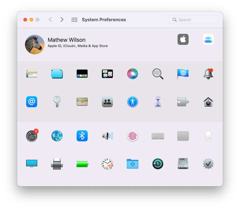
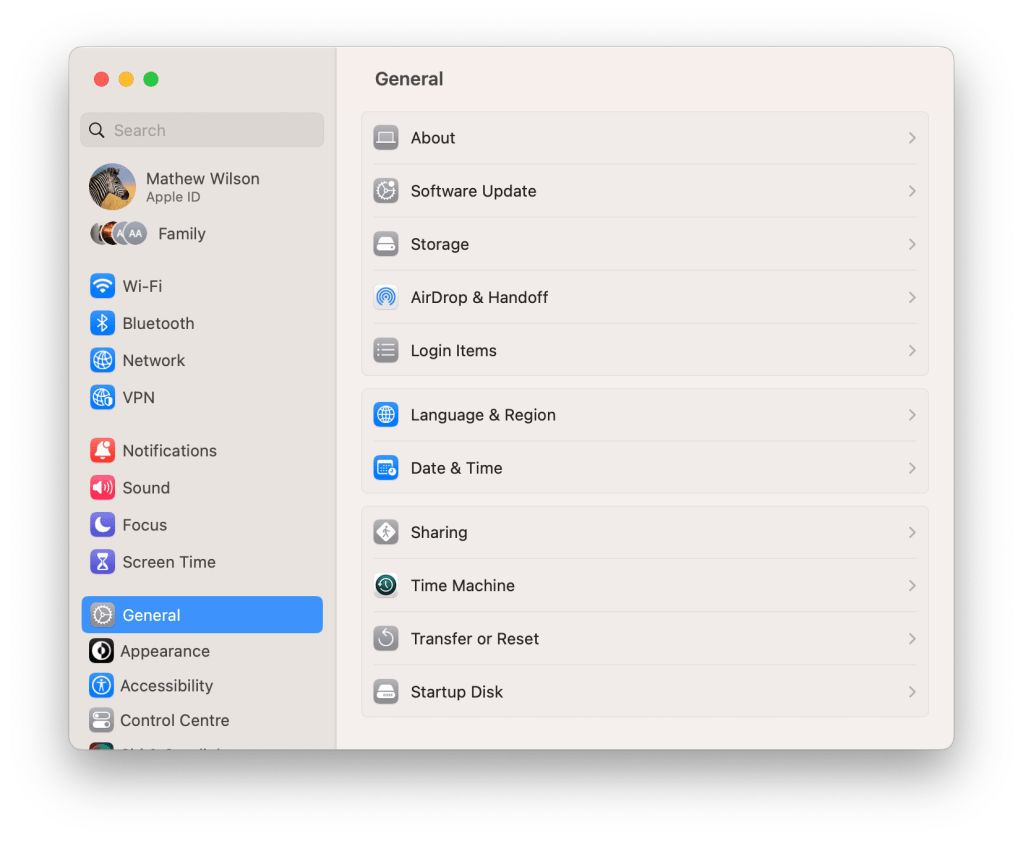
I mentioned a particularly massive example of this in a team meet up this week. That of the System Preferences pane in macOS. This thing:

I have hated and struggled with this every time I’ve opened it since it was first introduced in 2000. It SCREAMS at me, triggers 101 mental images, and almost always makes me forget what I opened it for.
Genuinely. I open System Preferences with a task in mind, like editing my hot corners, and when I see this collection of icons, illustrations, words and pictures, I am so overwhelmed with ideas and semiotic meaning that I can’t remember my goal.
If you’re struggling to understand, have a look at these icons on their own, and note how varied AND curiously similar some of them are in theme:
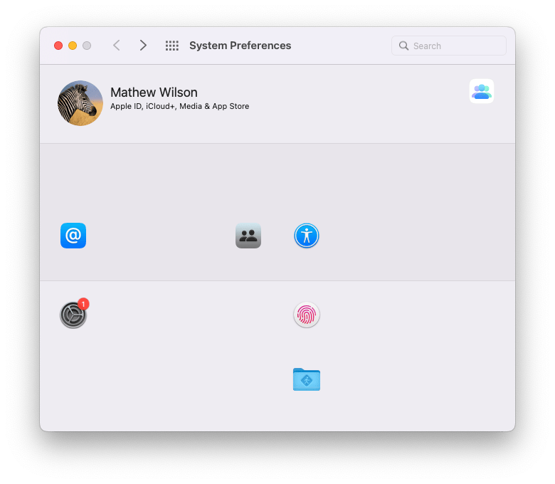
Still struggling? Try this view, and tell me where you would go for your personal user settings, or account settings? There are 4 icons that include people, one of a finger print (a classic ‘unique’ individual identity icon), one ‘at’ sign (another fairly common identifier of a contactable individual), and one System Preferences icon, which is where I’ve already gone to change my settings…
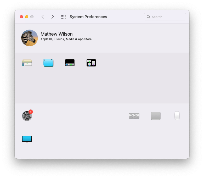
Or try this one, and go back to my hot corners example. Hot corner the corners of your monitor, that you access by moving your mouse or trackpad pointer, or by tapping a certain F Key. They cause different app window behaviours to occur on your screen / desktop. To me, every one of these icons represents a portion of using and setting hot corners, and when I’m faced with them all (and everything else that’s hidden in this example), I just get lost and distracted.
In contrast to the all icons view, I actually find this easier to navigate:

Better still, align the text left and pop it on a grid, and it’s unbelievably clearer.

Whichever way you prefer, I’m aware that I’m ignoring two elephants (bet you see them!) in the room with this example. Search and macOS Ventura.
To get over the issues I labour above, you can always simply search, and that’s what I always do. I sometimes try the icons, but mostly I try to ignore their distractions and type as quickly as possible into the search bar. Problem solved. But it doesn’t excuse the iconographic mess.
And Ventura? If you don’t already know, as I didn’t when I complained about the Preferences pane in the team meet up, it’s changed! After 22 years it’s finally changed:
They’ve brought it inline with iOS and iPadOS (and even called it System Settings). The left alignment alone makes this better for me, and the icons are almost small enough to ignore. Though to be honest, I would still go one step further (and make the settings feel more like my Mail app3):

Clean and clear.
But, boring
Yes. This is the killjoy part, and even after all my moaning, I still feel remorse for struggling and disliking icons and emoji so much. Because they’re fun. Friendly. Interesting. Not boring.
And being boring without icons is clearly an issue for some, as ‘boring.com’ aka GOV.UK once found out. Not that they didn’t try to not be boring. They made some lovely icons, but realised that they caused more confusion than clarity.
I feel that there is too much focus on icons rather than on clear, easy to read text.
Irene Melo
So, what do we do?
Accessibly and inclusion are hard, and while amazing improvements are happening, it can still feel like we’ve only scratched the surface. That’s not to say we need to ban all icons, emoji and images. I just think we need to engage more nuanced discussion about diverse and at times conflicting neurodivergent needs.
I wonder if speech interfaces will ever mature enough to solve some of these issues. Or if more intelligently adaptive interfaces will emerge. Ones that reveal only what a user needs at the point they need it. UIs that aim to educate as much as facilitate.
Although, I expect this was the aspiration of the designers that made Clippy. 😬
[Grimace, awkward, smile, shock, teeth, Chatterer (don’t image search if you don’t know), Wallace, Speak Out, etc.]
Footnotes
I’m sorry the yellow raised hand is so hard to see against my blog background colour. I’m going to look for a way to make it clearer, but I don’t want to change he whole colour of the site (I personally find this colour contract of background to text very easy).
1 Semantic interpretation is a separate issue and one that I’ll get to later this month. It’s more subtle than this issue with iconography and imagery, but potentially more impactful and incipiently damaging.
2 I find aphantasia fascinating. I would love to talk with someone who has it. Learning about it complexity shook up my understanding and belief about how the mind works. Thinking about it teases my brain in the same way that reading The Man Who Mistook His Wife for a Hat did.
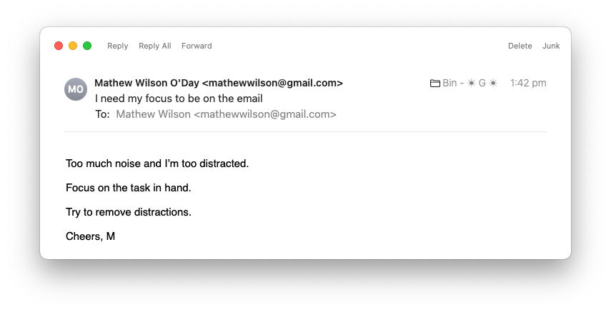
3 I realised years ago that the Apple Mail app allows me some ideal customisation. Here’s the default toolbar, with icons and text for tons of functionality:

But you can remove the icons and clean the whole area up:

And better still, you can edit what functionality you have up there. All I do in this view is Reply, Reply All, Forward, Delete or Junk. I don’t need anything else, and certainly don’t need icons to decorate and distract: