I’m often confused in situations like this:
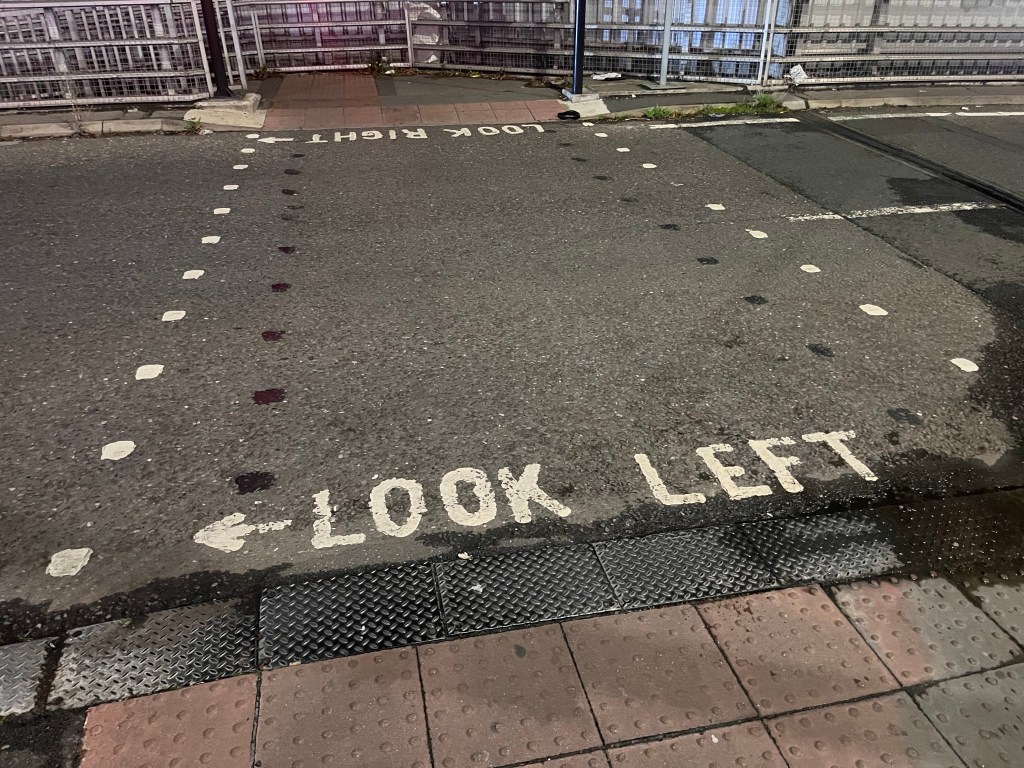
I glance ahead, and see ← LOOK LEFT, but I can also interpret ← LOOK RIGHT. This is because the words LOOK RIGHT are just as easy to read upside down. And despite the consistent left ← pointing arrow, the presence of the words LEFT and RIGHT add to my cognitive load and cause me confusion. This is just enough friction to mess with knowing which way to look, because generally, we’re a bit shit with confusing left and right.
I’m not even that bad with left and right. Far from perfect, but not bad. My trick is to very quickly imagine which hand I hold a pen: My right. I imagine holding a pen, and become overly aware of the side of my body that the pen is on. Then, I extend the awareness of that side into the entire hemisphere on that side. Next, I conclude that the opposite hemisphere must be the left. I then know which way is right and left in that moment of real world physical orientation. Easy. The whole process happens in less than a second.
While this may be a very personal method of knowing my right from my left, I don’t care, because again, people are bad with knowing left from right. Even really smart and capable people. All that matters is getting it right. Especially when you’re at risk from being hit by a car, or amputating the wrong leg of another human.
All this is to say that I think we should change this convention of alerting pedestrians about looking left and right at crossings. At the very least, I think we just remove the words LEFT and RIGHT. How much easier and clearer would this be:
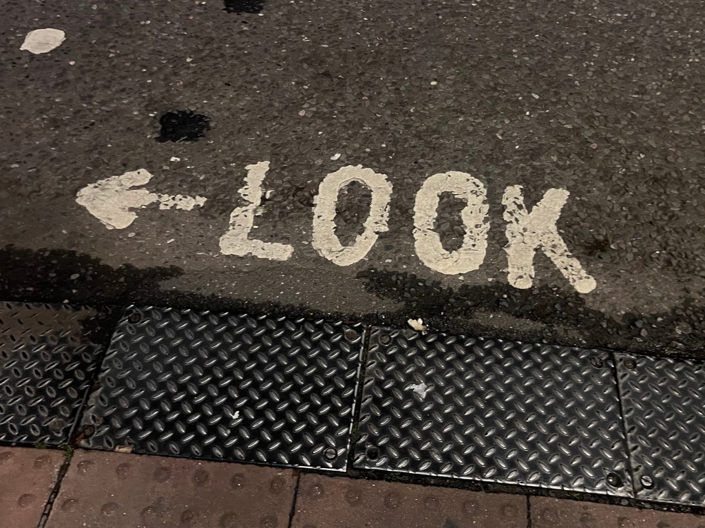
There is no ambiguity here. The left arrow is mightier than the word left. To illustrate this point, go back and look at the title of this post. You either hated the fact that I used a right arrow next to the word left, or you didn’t even notice. Either way, that’s cognitive load that you don’t need when at risk of not looking the right way when crossing a road.
Quit test: Look how much easier this is to process when upside down:

No way is anyone mixing their left from their right with an arrow.
And to be really sure, I wonder if this little detail might help further still:
I’d love to test these ideas. Perhaps in a similar real world way as I’ve heard Margaret Calvert and Jock Kinneir tested motorway signage (the story I’ve heard being that they zoomed people in a bus, down a road, in the rain, past road signs, to see which typeface was most legible).
Until I get 50 people on a bus, I’m putting my neck out to say that this would work better than what we currently do. And that with the pupils in the o’s, it’d be a lot more fun.
