TLDR for this post by Hugh Grant.
Dark patterns are deliberate design decisions that cause people to do things they don’t want to do.
Think of cookie notices on websites. The thing that is best for the user, in almost every case, is to NOT have any marketing cookies. The ability to opt out of those cookies though is deliberately made harder than opting in.
Dark patterns require designers to understand what you want to avoid, and then devise tricky user interfaces that cause you to do it.
This feels exactly like what’s happening at the moment when it comes to paying for parking. The systems, apps, and signage are sometimes so bad and convolutedly designed, that they are surely just ploys to cause errors that result in fines.
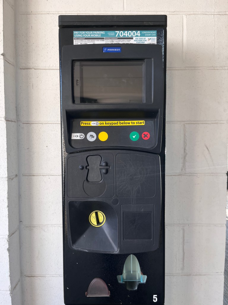
Take this example that I encountered with friends this weekend. This parking meter doesn’t take cards, or contactless, and we didn’t have any change (WHO HAS CHANGE ANYMORE?):

We were drawn to the shouty sign up top, that suggested a straightforward job of paying via text message. Like donating money to a charity, or voting for a live TV show:
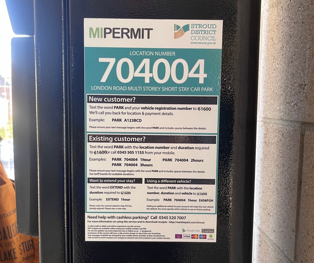
New customer? Text the word PARK and your vehicle registration number to 61600.
Easy seeming enough. This’ll be quick, we thought. But then you see that little second line…
We’ll call you back for location & payment details:

To be fair, this is technically clear and straightforward, but you what!? You want us to send a text to a random number that looks like it will cost to text to, and to then wait for an unknown length of time for a human to call us back. Then you want us to give them payment card details over the phone, in order to create some sort of user account with your service.
No. We just want to pay for parking.
We checked the side of the machine where it looked like there was another option, but instead it just repeated the spiel up top, along with instructions on how to extend a parking period.
Want to extend your stay? Text the word EXTEND with the duration required to 61600. Example: EXTEND 61600. Please note: You cannot extend a stay if it has expired. Please start a new stay:

These instructions are on a sticker on the side of the parking meter. How is this information useful for the person that’s out shopping and realises their parking has nearly expired? Or worse, that it has expired?
The expectation seems to be that you should know to take a photo of this sign before you leave. As if everyone is some sort of angry interaction designer, fuming at difficult user interfaces and taking photos of them.
I assume that this instruction is also texted back to you after you pay via text and set up your account, but we didn’t bother finding out. Instead, we searched deep in all our cars and found a stray pound coin (one that was saved for shopping trolly deposits), and luckily, parking in Stroud for an hour is super cheap at just 90p.
To pay, you enter the money first and it tells you how long you’ll get. You press the big green tick to confirm your choice, and discover that the machine doesn’t give change. Sure, it’s only 10p, but for a machine that insists on loose change only, the least it can do is give some back.
Whatever, we had paid, and received a simple paper parking ticket. Very easy to use. No likely issues with this user interface:

But there was an Easter Egg of sorts on the back.
Whoops… I’m the wrong way up!:

What a nice idea! It made me feel so conflicted after hating so much on their other design decisions. It also helped me to believe that it’s unlikely that the bad design elements are deliberate.
More likely I think, is that designing systems like these isn’t important enough to the company to put decent money toward. The design team was likely rushed, and not allowed to do user testing. No way were they paid to plan deliberately bad payment methods and interfaces.
I bet there’s not iteration or intent to revisit this either, as that would require an enormous amount of sticker re-printing and logistics to replace every meter all over the country. And where would the payoff be in doing that? Sinking more money into making something easier for a captive audience. It would be a very brave CEO to suggest that strategy. Or a very kind but daft one.
For the record, the MIPERMIT app is also pretty poorly designed. It’s convoluted to sign up to, the options are tricky to select, and it pushes you down a route to pay for text message alerts, rather than offering in app notifications.
However, all this is nothing compared to the very worst parking payment experience in Stroud. For that you need to go to the Five Valleys multi-storey and try PhoneAndPay. Or, just ask me for another long winded diatribe about slightly frustrating user experiences and 90p charges.
