That’s a horrible thing to read, isn’t it?
It conjures images of people being forced, against their will, to behave in a way that’s been deemed by someone superior, as the correct and proper way. As if the way they’re acting is deliberately naughty. Bad users. Silly users.
But… I bet most user centred designers have innocently thought this, or similar, when users haven’t paid attention to the hard work that’s gone into making something easy and safe for them to use.
I touched on this the other day, writing about designing for user error, but my mind keeps coming back to it. I also remembered two cases of signage that users consistently miss, despite best efforts of it being designed to prevent accidents. Both related to American bridges.
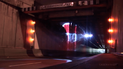
First is this image that I originally came across in 2011…

Secondly, a 99pi podcast episode titled 11 Feet, 8 Inches: Infamous “Can Opener” Bridge Continues to Catch Trucks, about a bridge that has had extensive warning signage added to warn drivers, and yet so many people still hit it that someone set up a website and webcam for it.*
So much effort going in to helping people uses roads safely, yet still people don’t see it. Users don’t read what they’re ‘supposed’ to, or behave like they ‘should’. They just keep behaving like they do.
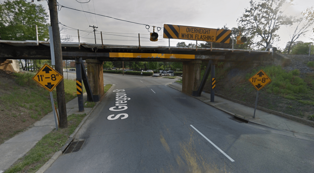
We have the same issue in the UK, where extensive work goes into specifying warning signage for low bridges, but clearly the issue still occurs…

And, in a Matryoshka doll-like way, there’s something interesting about how those warning signs are part of a much wider and extensively worked out system of warning signage. And how the webpages these instructions are on, are part of their own extensive system of instruction and standardisation. It’s system upon system of poured over design and consideration toward helping people to not make mistakes, yet, bridge strike doesn’t look like it’s going away.
In United Kingdom, railway bridge strikes (called “bridge bashing”) happen on an average of once every four and a half hours, with total of 1789 times in 2019. Several bridges have been hit over 20 times in a single year. The total cost borne by the state was around £23 million
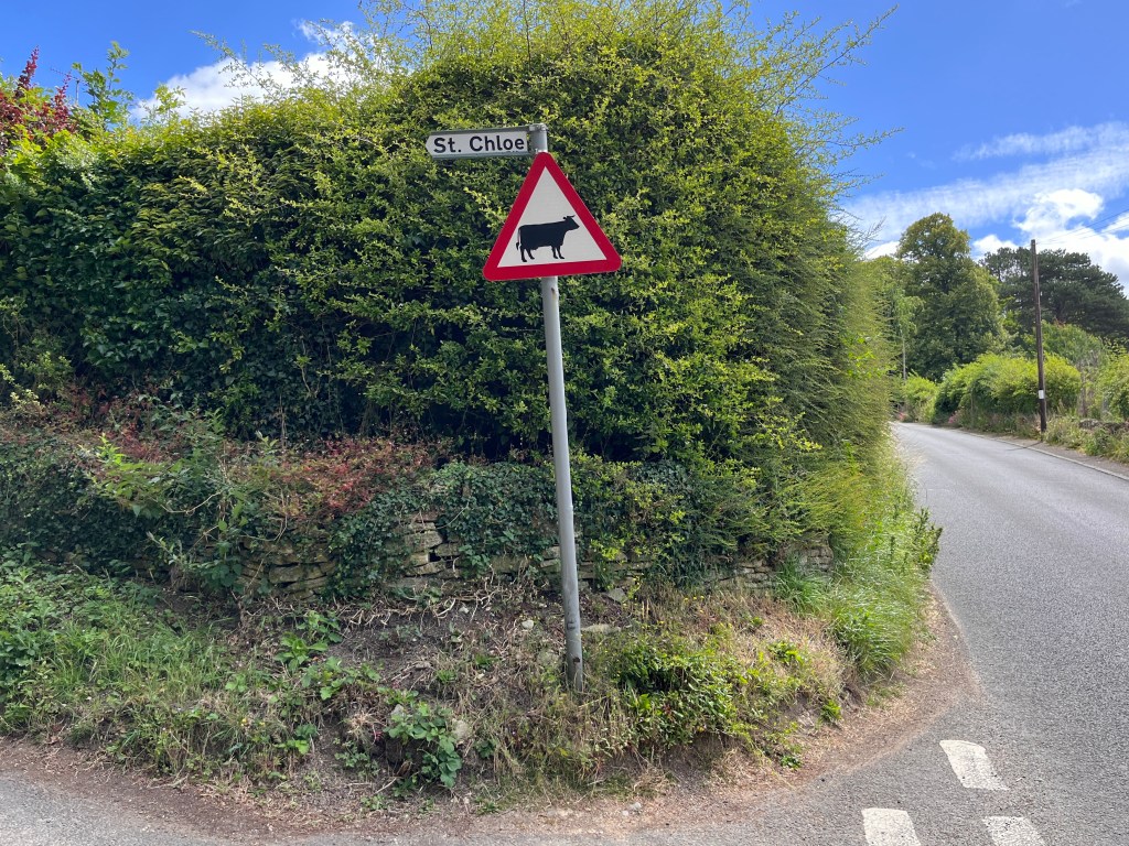
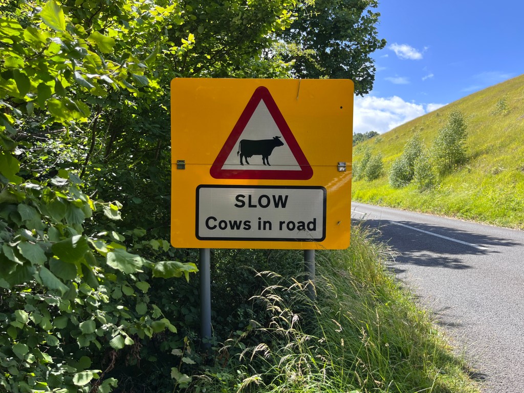
Locally to me in Stroud, there’s a similar road signage issue relating to cows, and aimed at preventing them from being hit by vehicles (they roam the common during spring and summer months). It ranges from the basic highways warning signage…
To more reiterated additions…
To large and louder attempts…
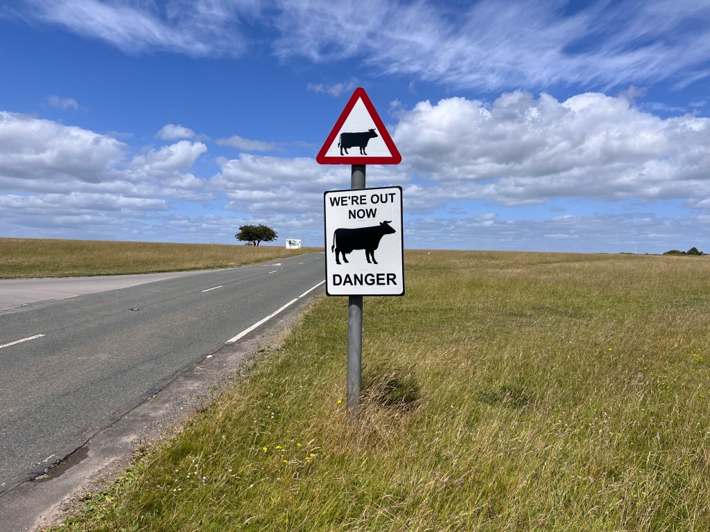
All the way to more creatively emotive and massive precautions…

Yet STILL the issue continues. Such clear signage, for such a clear danger, that people unanimously wouldn’t want to happen. Yet for some, it’s clearly just invisible.
Compare this to more subtle nudges that I’ve noted in the past. This contrast in the ability to nudge users and cause effect, but then scream at them repeatedly and have no effect at all is fascinating. The challenge of designing for humans, and trying to help them, or cause beneficial behaviour change. It’s more than design. It’s psychology.
And for me, this psychological angle is the front line of UCD right now. I’ve pointed out seemingly pointless signage before, where it’s put in place in an almost ritualistic way, rather than time being taken to really question the issue and possible solutions. We need to look at the behaviours and the wider systems around them, and borrow more from the practices of previously mentioned queueing UCD. Really looking at individual and group behaviour patterns.
*In the end they raised the bridge to 12 Feet 4 Inches, but it looks like it still gets hit from time to time!
Update, 5 September. Totally forgot to add this amazing alternate solution to warning signage designed to prevent bridge strike. Thanks for the reminder Erin.